Colour Psychology
Beginner's Handbook Reading Time: 5 minutes
What Your Brands Colours Say About You
There is no definite right or wrong answer when picking out your brand colours. But you can heavily influence your brand's personality with the colour palette you choose.
Visuals matter. Your customers might not consciously notice the calming blue schema you've chosen for your store or catch on to that attention-grabbing red add to cart button, but their subconscious will.
What do colours mean for your brand and the face of your store? How does colour affect consumer behaviour? Here's a closer look at colour psychology and how colours can help you get the most out of your business.
Why is Colour Important in Branding?
Believe it or not, picking out your brand's colours is one of the most critical factors to consider when building its aesthetic. Choosing the right shades can hugely benefit your brand, just as going with the wrong hues can have damaging effects.
Colours are a powerful tool to influence your target audience's emotions, experiences, and behaviours. Colour is important because it is where first impressions of customers are based. People form opinions within 90 seconds of their initial interactions with people or products, and studies say that up to 90% of their assessment could be based on colours alone.
How to Select Colours For Your Brand
Different hues represent different qualities. Aim for a colour palette that represents your brand's personality best and mirrors the identity you are trying to convey. Colour psychology helps us understand how colours influence our moods, emotions, feelings, and habits. While there's still a lot to learn and consider about colour psychology, colours have certain characteristics linked to them.
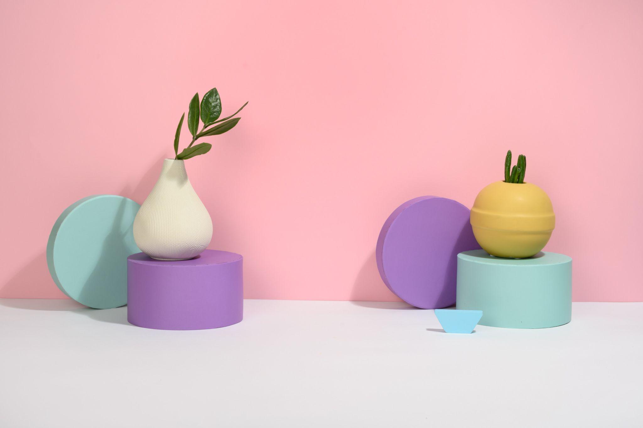
Colours can say a lot about you. Warm colours (reds, yellows, oranges) evoke feelings of creativity, friendliness, and passion, while cool colours (blues, greens, purples) represent maturity, peace, and serenity.
Take a deeper look at what ten of the most common colours represent and how they can portray your brand's identity.
- Red: Red excites people. It's often associated with youth, passion, energy, and boldness. Some of the world’s most iconic companies, like Coca-Cola, Virgin, and Lego, use red as the dominant brand colour.
- Blue: Blue is a common contender for brands. Blue hues give off feelings of peace, tranquillity, security, and trustworthiness. Everyone from tech giants like Facebook and PayPal uses blue to denote safety and efficiency, while plenty of service-based companies like Ford use blue to showcase dependability and strength.
- Green: Green is another one of the most widely used brand colours. Green is an emotionally positive colour embodying health, harmony, freshness, and growth. Everyone from food labels, tech companies, fitness brands, and more use green quite frequently.
- Orange: Orange symbolizes fun energy, warmth, excitement, friendliness, and cheapness. Orange is a go-to hue to target the fun-loving adventure type of consumer.
- Yellow: Yellow is associated with happiness, optimism, and creativity. We often think of the sun when we think of yellow, and similar to the sun, yellow can bring clarity, warmth, and cheeriness. You may notice yellow being used a lot in the background of logos like McDonalds, DHL, and Schweppes.
- Pink: The colour pink is often associated with femininity, youthfulness, and beauty. Not surprisingly, it's one of the most widely used colours in the cosmetics and personal care industries.
But don't put pink in one box. Just because it's known as a "girly" colour doesn't mean gender-neutral brands can't use it to invoke creativity and imagination.
- Black: Black depicts sophistication, exclusivity, power, stability, and intelligence. Black can be used as a primary colour for your brand, or you can use it as more of an accent colour.
- White: White is an inherently positive colour and another standard background colour. White embodies simplicity, purity, and cleanliness. Brands will use white to convey a level of exclusivity and luxury.
- Purple: Here's another common colour in the beauty and cosmetic industry. Purple indicates nobility, respect, wisdom, and wealth and is often denoting premium products or services. Some notable brands that use purple are FedEx, Cadbury, and Yahoo.
- Brown: Brown is closely associated with earthiness, honesty, and dependability. It's used a lot in the food industry and rarely used alone. Think M&Ms for reference. take into account whether your products fit your brand image. For example, if your main focus is selling luxurious clothing items, orange probably shouldn't be your top pick, while pink might work perfectly for a home decor collection.
Another thing to consider is your competition. The success of your brand is dependent on so many other factors like your marketing, branding, products, customer service - the list goes on. So take a look at what colours your competition uses when you're starting a brand from scratch. You may learn more about what shades work and what don't for your niche by doing a little digging.
Going Beyond the Colour Wheel
At the end of the day, your brand colours can impact your success, but following up with your success matters the most. So focus on providing top-quality products, learning more about your customers, and growing your brand.